Oak Equipment
Background
Oak Equipment specializes in creating home gyms designed for Nordic households. Over a 14-week project, my team of 4 UX-Designers at Stockholm Institute of Technology partnered with Oak to improve the user experience on their website.
Timeline: November 2022 - March 2023
Role: User research, service design, prototyping and testing
Tools: Figma
The problem
Oak Equipment had encountered a challenge with a high dropout rate during the payment process. This raised concerns about potential usability, trust, or technical issues that are impacting the overall user experience.
Project goal
The goal was to help OAK get a deeper understanding of their users to optimize their ability to meet customer needs effectively and improve conversion rates.
The process
User Research - Service Design - User testing
User research
The research process involved interviews and observations with 10 users from the target audience (individuals aged 35+, homeowners, interested in fitness) which were divided into two parts. Initially, I asked question to understand their training lifestyle, motivations, and preferences. Additionally, I conducted two user tests on two different websites—Eleiko, a competitor to Oak, and Oak's platform.
Participants were provided with scenarios to make a hypothetical purchase of an item on each website. I did this to gain deeper insights into their needs and purchasing behaviors concerning workout equipment, while also conducting a competitive analysis.
Insights
• Unclear CTA buttons
• Readability
• Unclear payment methods
User tests revealed issues with website copy, visual hierarchies, and unclear payment methods on OAKs website. Participants were unsure where the CTA button would lead them and felt overwhelmed by excessive text on the product page. But the most important finding relating to the problem statement were that users felt confused by the unfamiliar payment options at checkout, causing purchase cancellations.
Behavioral archetypes
Based on the insights, we categorized them into two behavioral archetypes to understand their similarities and differences, aiming to create a more personalized user experience addressing each type's specific needs.
The impatient doern
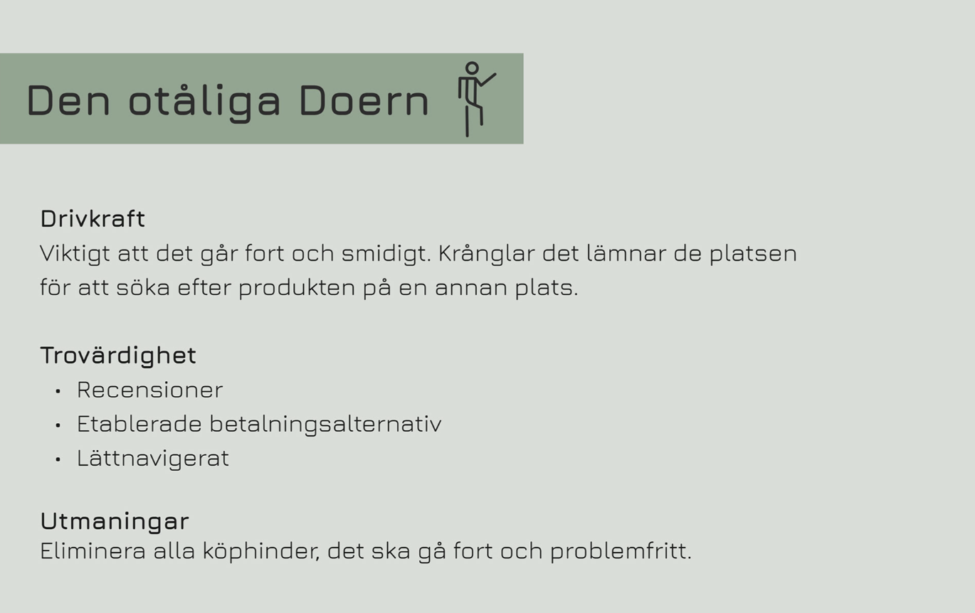
The impatient doer wants things to go fast and smooth. Easy navigation is important. If it gets complicated, they leave the site to search for the product elsewhere. They are not detail-oriented. They value trust, relying on established payment options and reviews for credibility.
The structured analyst

The Structured Analyst is detail-oriented, taking time to compare various websites. They rarely make impulsive purchases, instead, they thoroughly read content to make sure they get as much information they need to make a decision. They value trust, relying on established payment options and reviews for credibility.
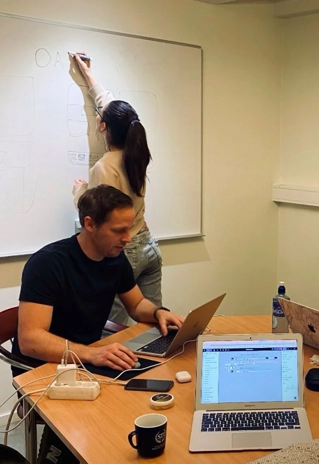
Service Design
During a workshop with the client it was decided that our primary focus would be on the product page, since the majority of the users' pain points were related to this specific area.
To ideate solutions we did a brainstorm session on how we might improve the visual hierarchy on the product page, making it more accessible and user-friendly for our target audience.
I was responsible for visualizing this. I began with creating a lo-fi wireframe, prioritizing the design's structure over details like color or copy, to show our client our concept idea.
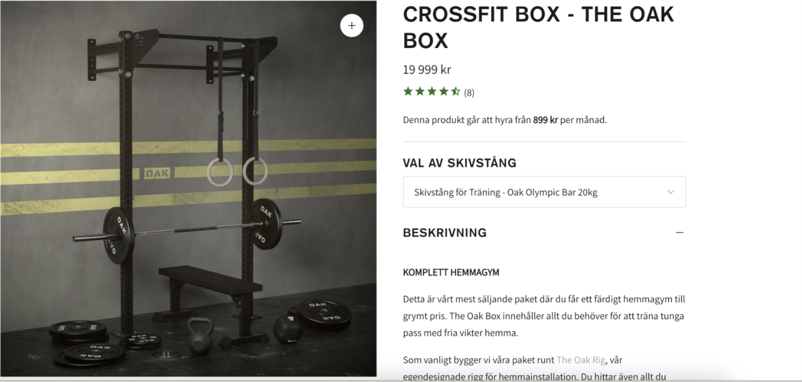
Improvements
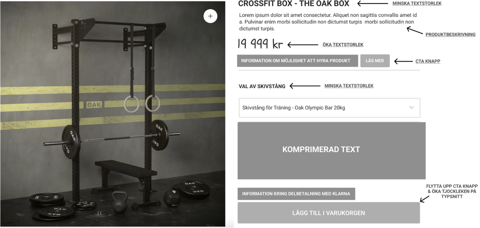
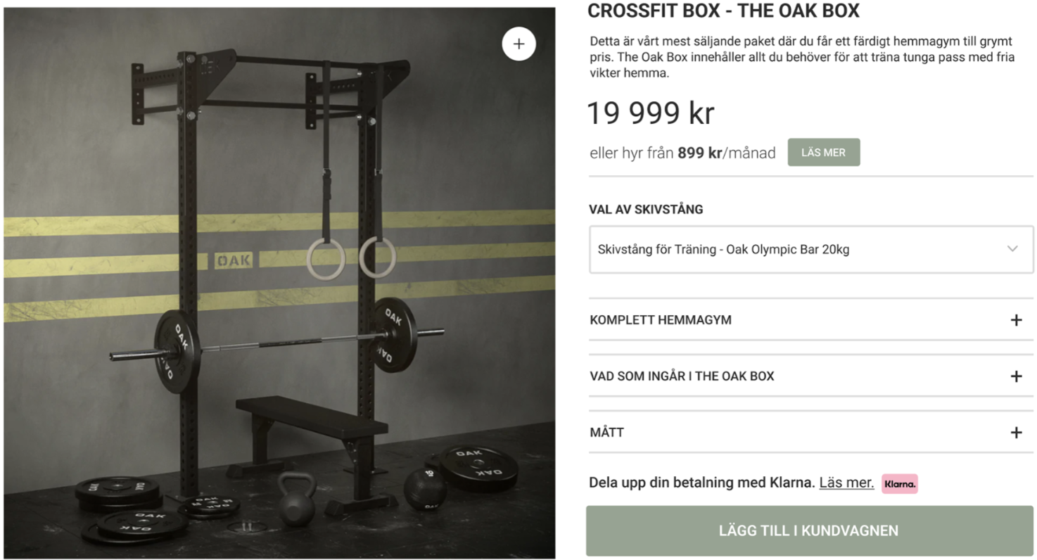
Less text
The primary CTA button was invisible on the product page at first glance due to excessive text. My solution was to chunk the text to allow users to engage with information in smaller sections, avoiding cognitively overwhelm.
Highlighting price
Our research revealed that pricing is crucial for the target audience and should be one of the most visual displayed elements. Therefore I worked on highlighting the price more.
Clarifying buttons
Previously, there was no visual distinction between linked text and other text on the website. Users were particularly confused by the unclear 'rent-link.' To address this, I added a CTA button beside the text for improved clarity.
Removing rating system on product pages
The rating system took up space from other important information, and the few reviews available could have negatively impacted credibility. Therefore, I removed the rating system from the product page and suggested that they instead focus on highlighting their TrustPilot reviews on their website.
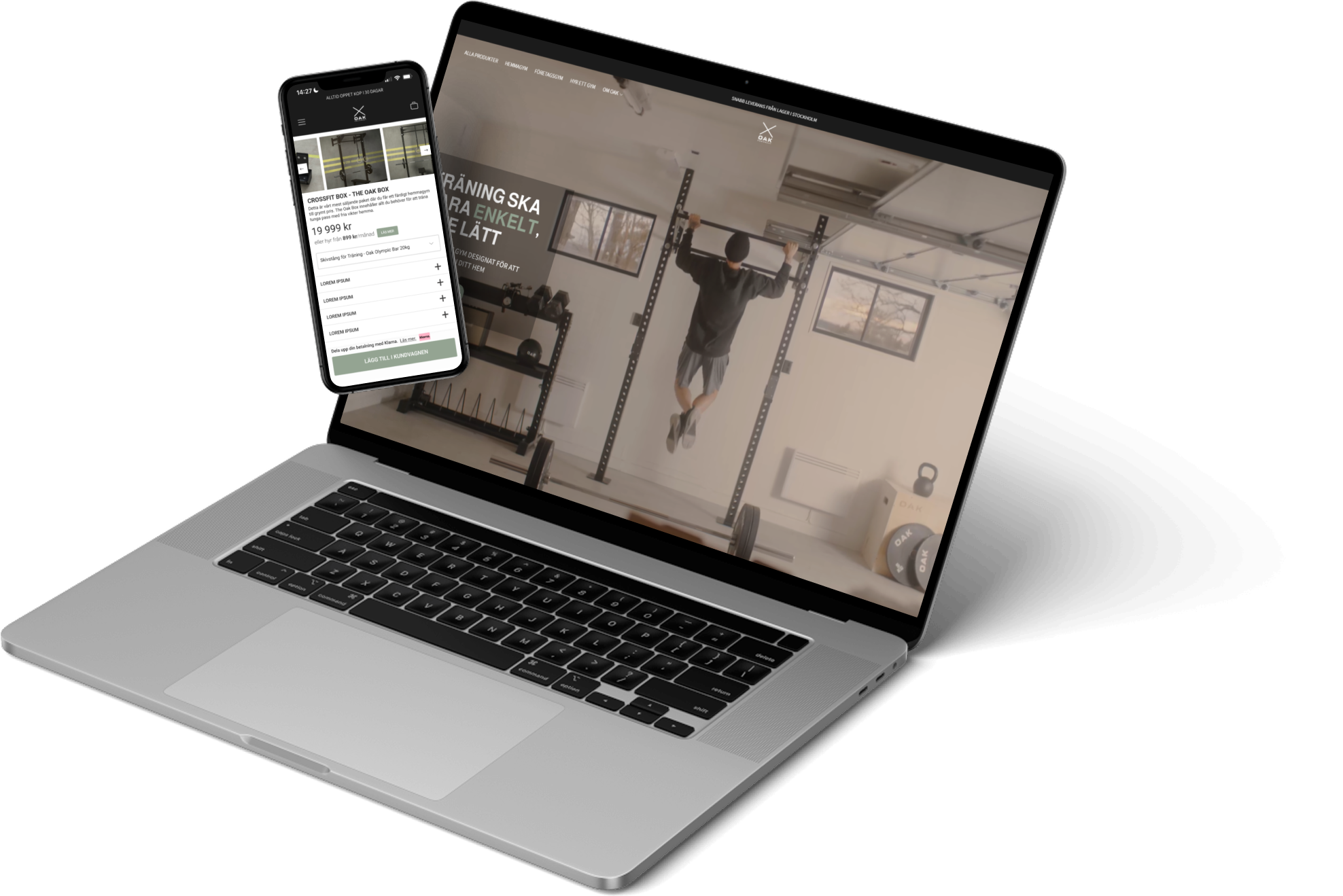
Product page without adjustments
Product page with adjustments
User testing
Guerilla test
I conducted a guerrilla test with 5 randomly selected individuals in a shopping mall to answer questions about the product page that I designed in Figma.
Using a paper prototype of a hi-fi version of the design, I asked the participants where they would navigate to for specific information and their overall impression upon viewing it. I did this because it's a quick and easy method to gather feedback from real users and identify any potential issues in the user interface early in the process.
The result was overwhelmingly positive.
3 out of 5 mentioned that the price was the first thing they noticed.
5 out of 5 clicked on the nearest CTA button to gather more information about renting the product.
5 out of 5 clicked on the accordions to access more information about the product.
5 out of 5 found the 'add to cart' CTA button at first glance.
2 out of 5 mentioned that the page had a minimalist and clean design.
Results
The participants appreciated that the prototype was clean, minimalistic and that the CTA buttons were easy to find. However, there were areas for improvement:
5 out of 5 users found it difficult to determine the category in which they could find the information they were looking for.
Modified prototype in Figma
Lessons Learned and next steps
Based on our findings, we recommended improvements to help users navigate and find information more easily. One key idea was to introduce accordion sections to group related content and reduce visual clutter. For example, a section called "What’s included" could help users quickly locate details about training packages, which had previously been hard to find.
If we had more time, we would have liked to conduct an A/B test comparing the old and new versions of the site to measure which design was more effective in terms of user engagement and conversion.

✨ Thank you for scrolling ✨