Lokaalt mobile redesign
Lokaalt is a startup company seeking to help people connect with their surroundings and support local sustainable businesses through a personalized digital bulletin board.
Background
Timeline: May 2023 - June 2023
Team: 2 UX Designers
Role: User research, visual design, prototyping and testing
Tools: Figma
The problem
As social media continues to expand rapidly, it becomes increasingly challenging for small local businesses to cut through the noise and effectively connect with their local community. Meanwhile, local residents encounter difficulties in staying informed about the events and activities taking place in their own neighborhood.
Project goal
The goal of this project was to ideate solutions and create prototypes of a product whose development process and iterations are based on the insights gained from user research studies and usability tests.
Our task was to identify what the different target audiences want from Lokaalts platform in terms of functionality and visual design.
Process
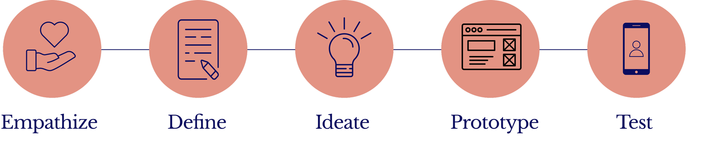
Empathize
*
Empathize *
I conducted 5 semi-structured interviews with 5 small business owners to uncover their advertising habits, needs, and pain points. My focus was on understanding their interest or lack thereof in Lokaalt.
Additionally I interviewed 5 civilians, millennial with families, what they considered their “local area” and what problems, if any, they wanted Lokaalt to solve.
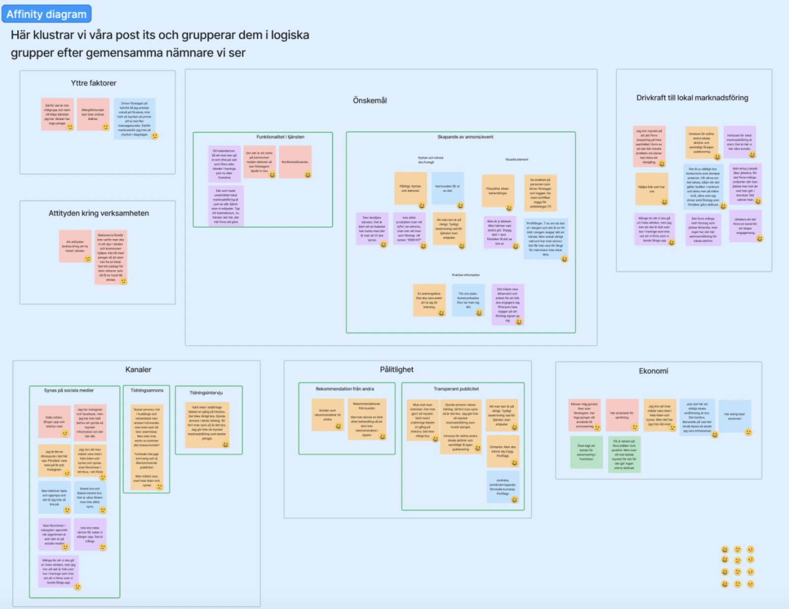
Synthesizing the material
We organized the Post-its into categories within an affinity diagram. This process provided me with an overview of the responses and revealed patterns among them
Insights
Small businesses often get lost in the noise of social media and prioritize local word-of-mouth. There's also an interest in supporting other local actors and protecting their whole local community.
Civilians are curious about local happenings and find Lokaalt appealing because it has the potential to connect individuals with shared interests, filling a void that they perceive in local Facebook groups.
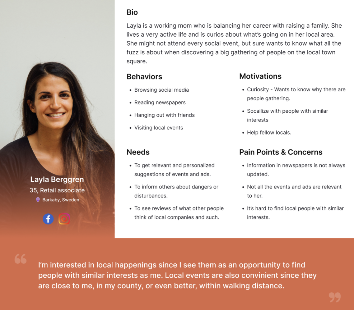
User Personas
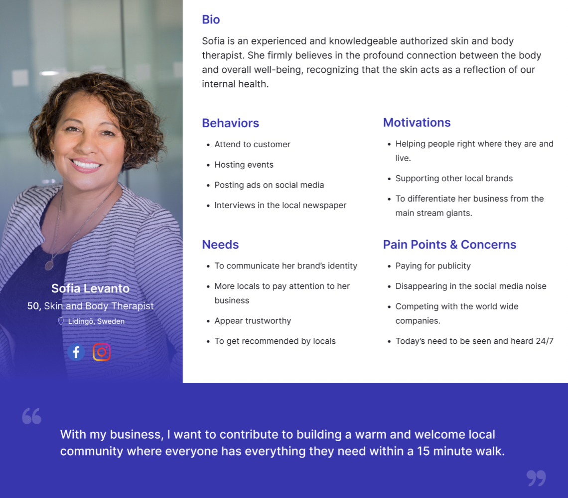
Based on our findings I created two personas that embody the traits of the target audience. This helped me empathize with the user and understand their needs, experiences, and goals, and design a more effective and user-centered solution for the project.
Define
*
Define *
We brainstormed ideas on based on our research and decided upon following design features:
#1 Bulletin Board
Users expressed a desire to see various events and partially share this type of information about their area, while local businesses wanted to post news, offers, and events specifically. A bulletin board was created to to accommodate user preferences for sharing local information and businesses' interest in posting news, offers, and events.
#2 Map
A map feature was implemented for two primary reasons. Firstly, users expressed a strong desire to visually locate various events and other happenings on the map. Secondly, businesses wanted to ensure easy discoverability for potential customers.
#3 Filtering options
User desired to sort information according to their interests and remove irrelevant content. This feature would allow users to customize their experience and focus on the information that matters most to them.
#4 Creation of Events
User desired to sort information according to their interests and remove irrelevant content. This feature would allow users to customize their experience and focus on the information that matters most to them.
#5 Reviews
Based on our insights that customer recommendations proved to be the most effective advertising method, we implemented reviews from Trustpilot that can be shown in companies profiles.
Ideate
*
Ideate *
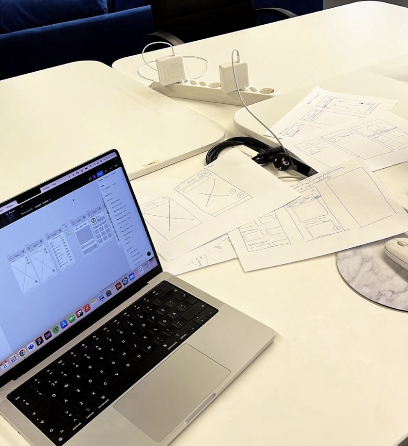
To quickly visualise our ideas and get creative I implemented the the crazy 8 method. This helped me get creative and sketch different ideas quickly. We then moved on to creating lofi-wireframes of our primary views, the bulletin board and map page and conducted 5 user tests to validate if our concept works or not.
Prototyping
*
Prototyping *
We created an initial prototype using the existing color palette and based on insights from our user interviews. The goal was to quickly visualize the core idea and test the concept with a local and user-friendly approach in mind.
Test
*
Test *
I conducted 5 usability tests to evaluate user comprehension of our design and gather their perspectives on what actions they could perform within the interface.
#1 Messy Bulletin Board
Users found the bulletin board to be cluttered with excessive activity, but Lokaalt wanted to maintain the lively essence of the board. To strike a balance, I suggested to retain the two-column layout with varied sizes of notices, as it added vibrancy. However, we made efforts to standardize the cards by color-coding them based on categories and removing the option to use different fonts for text.
Additionally, we created a calmer atmosphere by introducing more white space in the background, resulting in a more serene user experience.
#2 Setting Position on the Map
Setting position on the map before accessing the platform was confusing. Users preferred to land on the start view and select their municipality from there.
#3 Create Event
Customizing notices with fonts and colors was not a priority. Instead, focus shifted to adding images and text efficiently. As a result, we removed the options for selecting different fonts and implemented a default font for consistency. Additionally, we made the color of the notice adapt to the chosen category, providing visual clarity and cohesion.
#4 Order of Notices
Users found the sorting of cards to be inaccurate, and it was deemed more relevant to have notices arranged in the order of their scheduled occurrence rather than the date they were posted. To address this, we restructured the sorting mechanism to prioritize the chronological order of events, ensuring users can easily access the most timely and relevant information on the notice board
#5 Categories on the Map
Users faced challenges in understanding the symbols on the map. To address this issue, we decided to adopt familiar symbols from other maps services, ensuring greater user familiarity and ease of comprehension. Additionally, we introduced a filtering system for events in a pill-shaped format on the map. These pill-shaped filters display both the corresponding symbol and the name of the category, making it easier for users to identify and select the desired event categories.
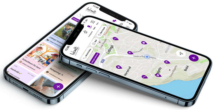
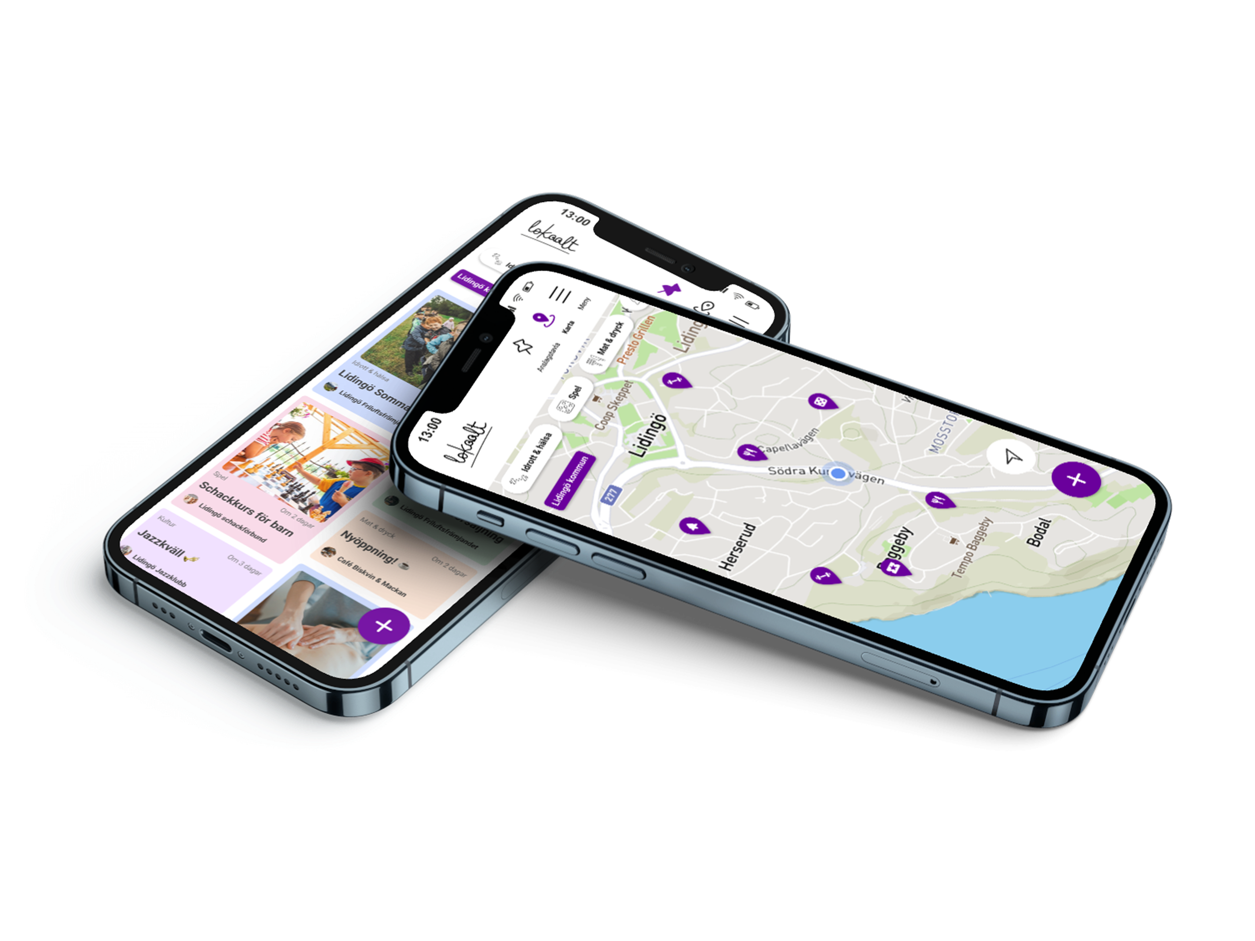
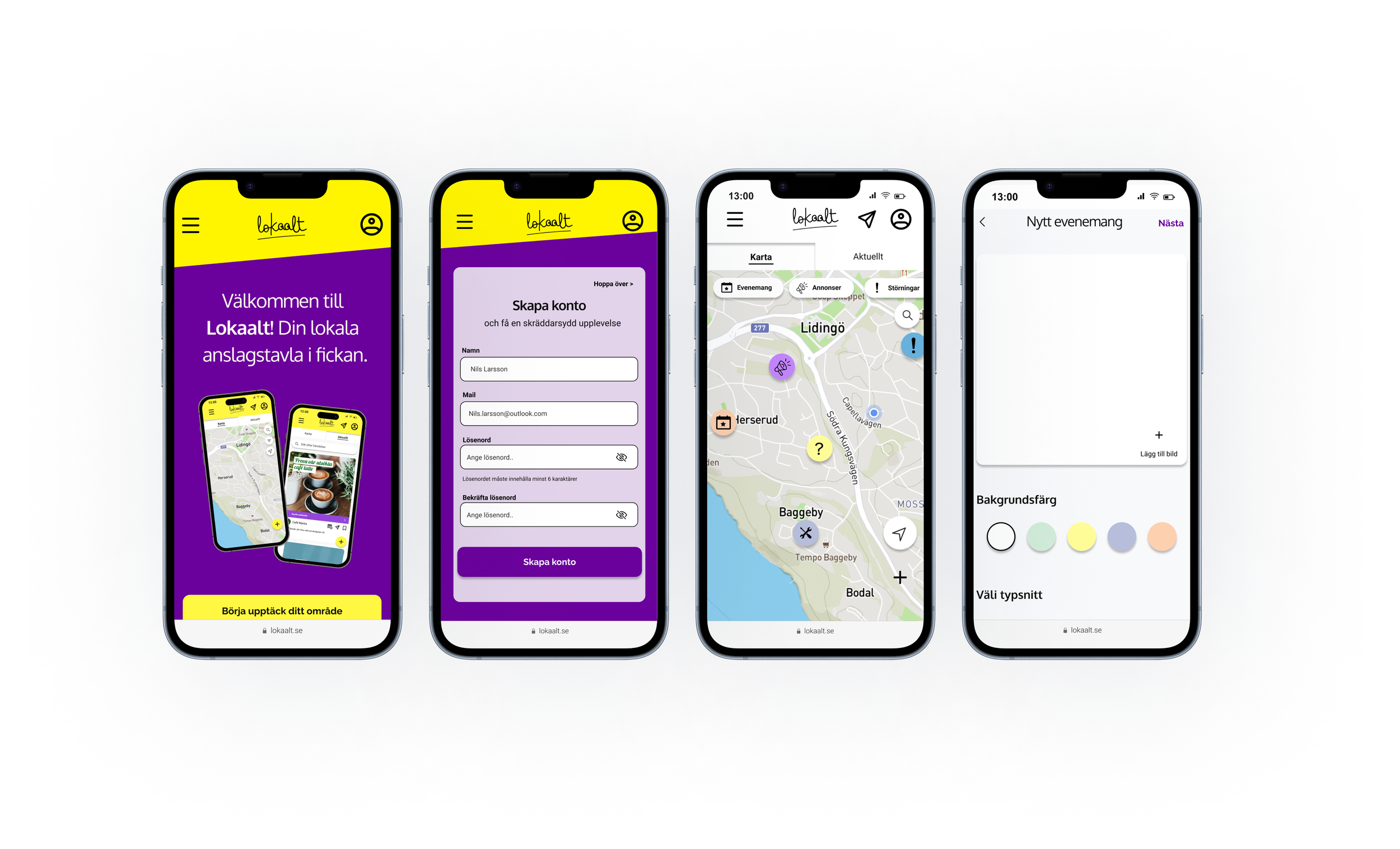
Final Design
Based on user feedback, the prototype was improved and a high-fidelity version was created. I identified that the previous primary colors were too intense when paired with the card colors. To address this, I reimagined the design by making the cards the focal point in terms of color while keeping the rest of the design more neutral. This adjustment was supported by feedback from UX experts.
To create a welcoming and engaging user experience, I adopted a playful tone and incorporated soft colors throughout the design. This approach aimed to establish a friendly and approachable atmosphere, allowing users to feel comfortable and immersed during their interactions.
Additionally, I introduced dark purple as a primary call-to-action color to give the design a modern appearance. Varying the card sizes helped maintain a vibrant bulletin board feel. For the map view, I drew inspiration from other map services to create a sense of familiarity for users.
Lessons Learned and next steps
#1 Early Testing of Lo-Fi Designs
I learned that obtaining user feedback at an early stage significantly improves the design process. Lo-fi design testing is fast and iterative, allowing for simple adjustments on the fly based on rapid feedback from real users. Ultimately, this approach prevents expensive investments in developing a flawed design, effectively saving resources.
#2 Iterating from Lo-Fi to Hi-Fi
Due to time constraint we did the mistake to rush into high-fidelity design early in the process, which proved counterproductive. This led me to realize the value of starting with sketches and low-fidelity wireframes and validating ideas before investing significant effort in high-fidelity designs.
#3 Balancing User Needs and Stakeholder Interests
In the fast-paced startup environment, involving the client in the design process became crucial. Despite time constraints, collaborating more extensively with stakeholders through workshops could have facilitated better alignment and more informed design decisions.
✨ Thank you for scrolling ✨