ICA App – Personalization of the Recipe Page
Background
The ICA app helps users with grocery shopping, planning, and finding recipes. Previous research showed that users expect the app to recognize their preferences and suggest relevant recipes.
My focus during the internship was to explore how the recipe page could be personalized to better meet these expectations.
Timeline: February 2024 - May 2024
Role: User research, visual design, prototyping and testing
Tools: Figma, Hootjar, Teams
Hypothesis
By creating a personalized recipe page, we believe we can help users save time in their planning by providing relevant, tailored content while avoiding “information overload.”
User research
*
User research *
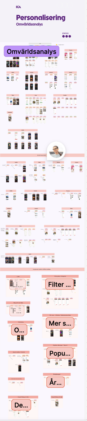
Competitor & Trend Analysis
To identify best practices, I conducted a benchmark analysis of how other services personalize their content.
This included:
Analyzing personalization features in apps I use regularly.
Researching leading services known for strong personalization.
Documenting UI patterns and features that stood out.
Organizing insights into categories, such as quick filters and dynamic content.
Key takeaways:
Category-based recommendations (e.g., YouTube, Spotify)
Popularity-based suggestions (e.g., Netflix, Hemköp)
Easy customization from the start (e.g., Pinterest, TikTok)
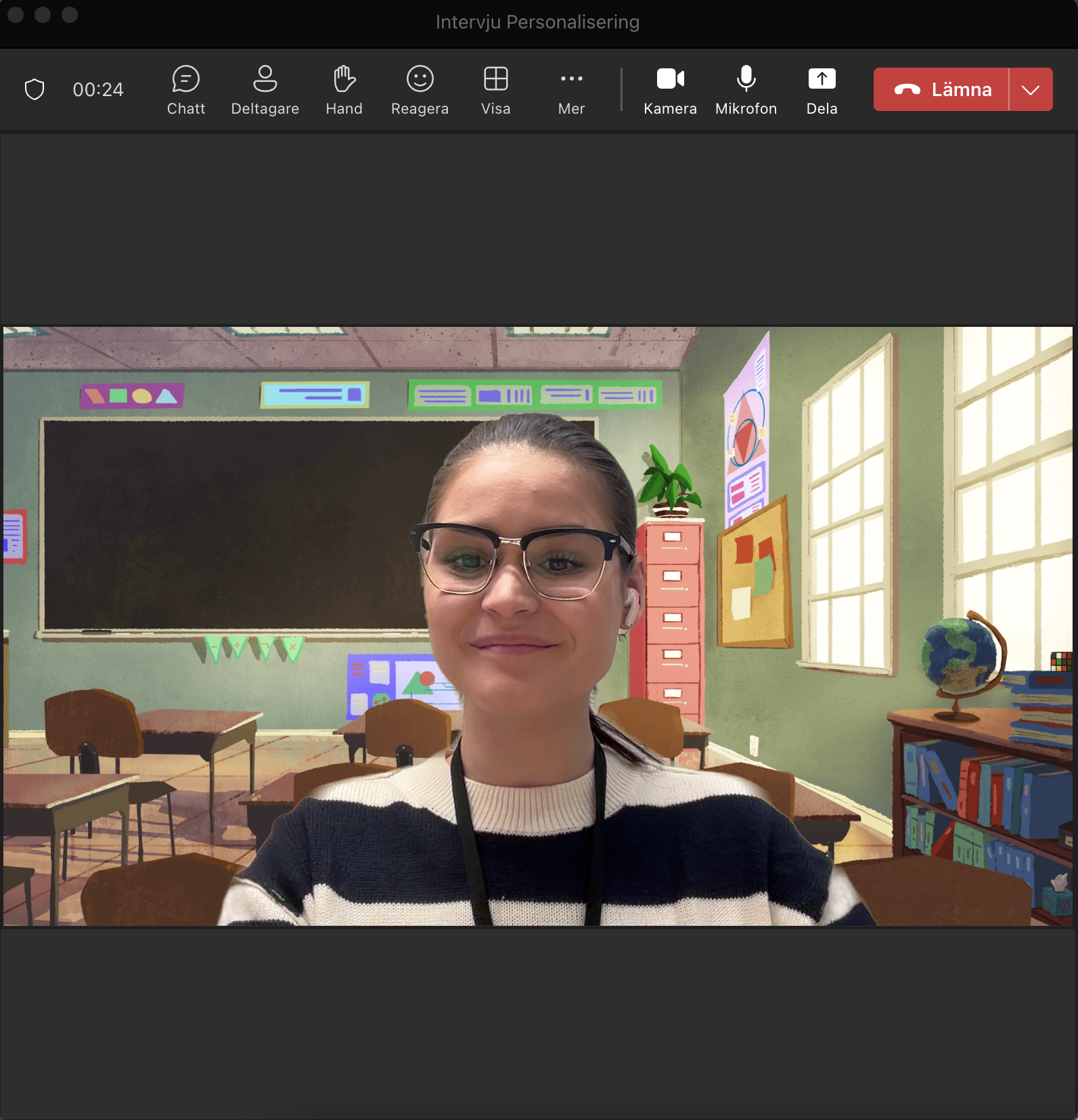
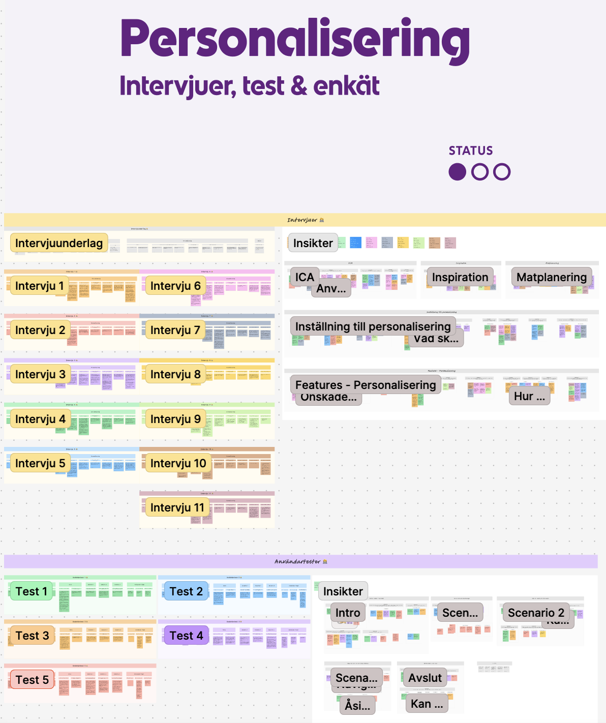
Interviews
To gain deeper insight into user expectations, I interviewed 11 ICA customers across various ages and household types.
Key Insights:
Users appreciate feeling seen by services that understand their preferences.
Overpersonalization can feel limiting or even invasive.
There’s a desire for tailored recipe suggestions based on:
Purchase history
Saved or liked recipes
Previous cooking behavior
Users want to set preferences such as vegetarian, child-friendly, or allergies—and easily change them.
A combination of manual input and behavior-based recommendations was preferred.
Users are motivated by inspiration, but not too far out of their comfort zone.
Survey
To gather insights on recipe personalization, we launched a Hotjar survey in the ICA app on the recipe page. Over 430 users responded.
The majority showed interest in features like weekly menus and recipe suggestions based on what they have at home. Users also wanted to set preferences like favorite ingredients, household size, and dietary needs.
Personalized suggestions were seen as helpful for saving time and simplifying meal planning
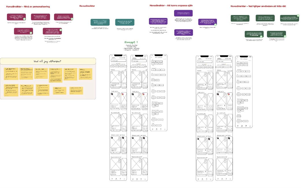
Ideation
*
Ideation *
Based on the insights, I began generating ideas:
Brainstorming – writing down all potential ideas and areas to explore.
Sketching – focusing on layout and structure.
Designing in Figma – creating detailed mockups for testing.
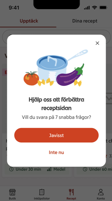
User Testing
*
User Testing *
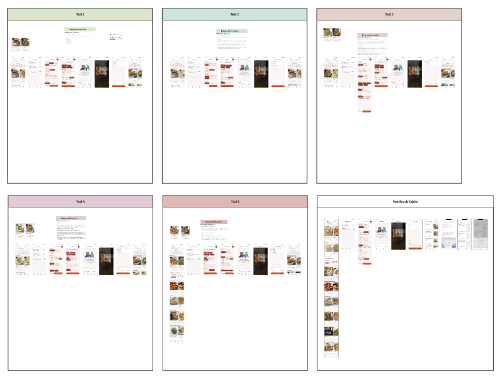
I tested the concept with 5 ICA customers, again from mixed demographics.
Testing Process:
Each session was customized based on the user’s preferences (collected via a short pre-test survey).
Users were given scenarios to explore the prototype.
Feedback focused on functionality, flow, and emotional response.
Key Findings:
Quick filters were appreciated, but not essential.
The page hierarchy felt unclear; users wanted to scroll through more content.
A feature that lets users add ingredients they have at home and get recipe suggestions was misunderstood as an ad and felt hard to read.
The hypothesis was confirmed: users felt this would simplify their daily planning and bring practical value.
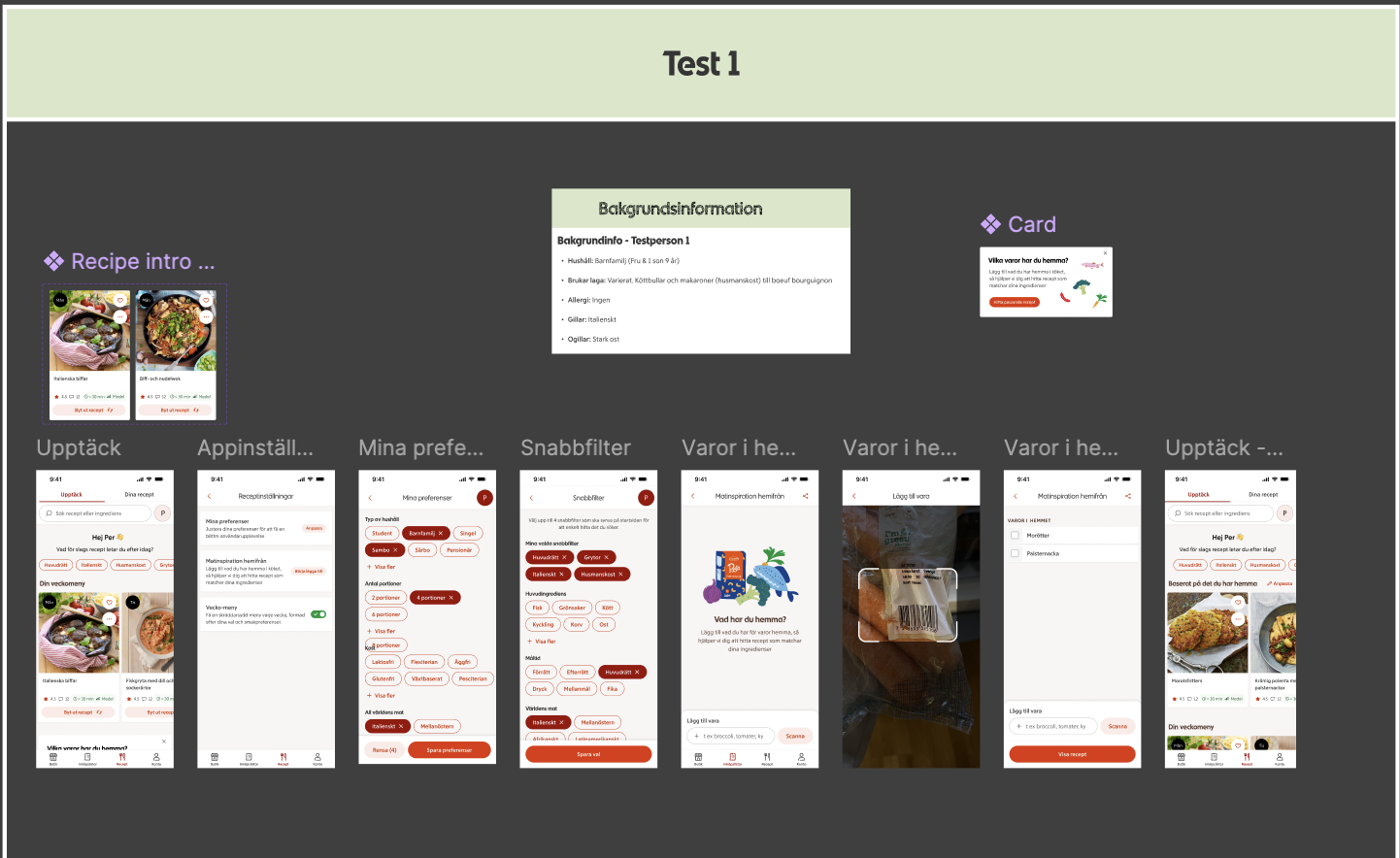

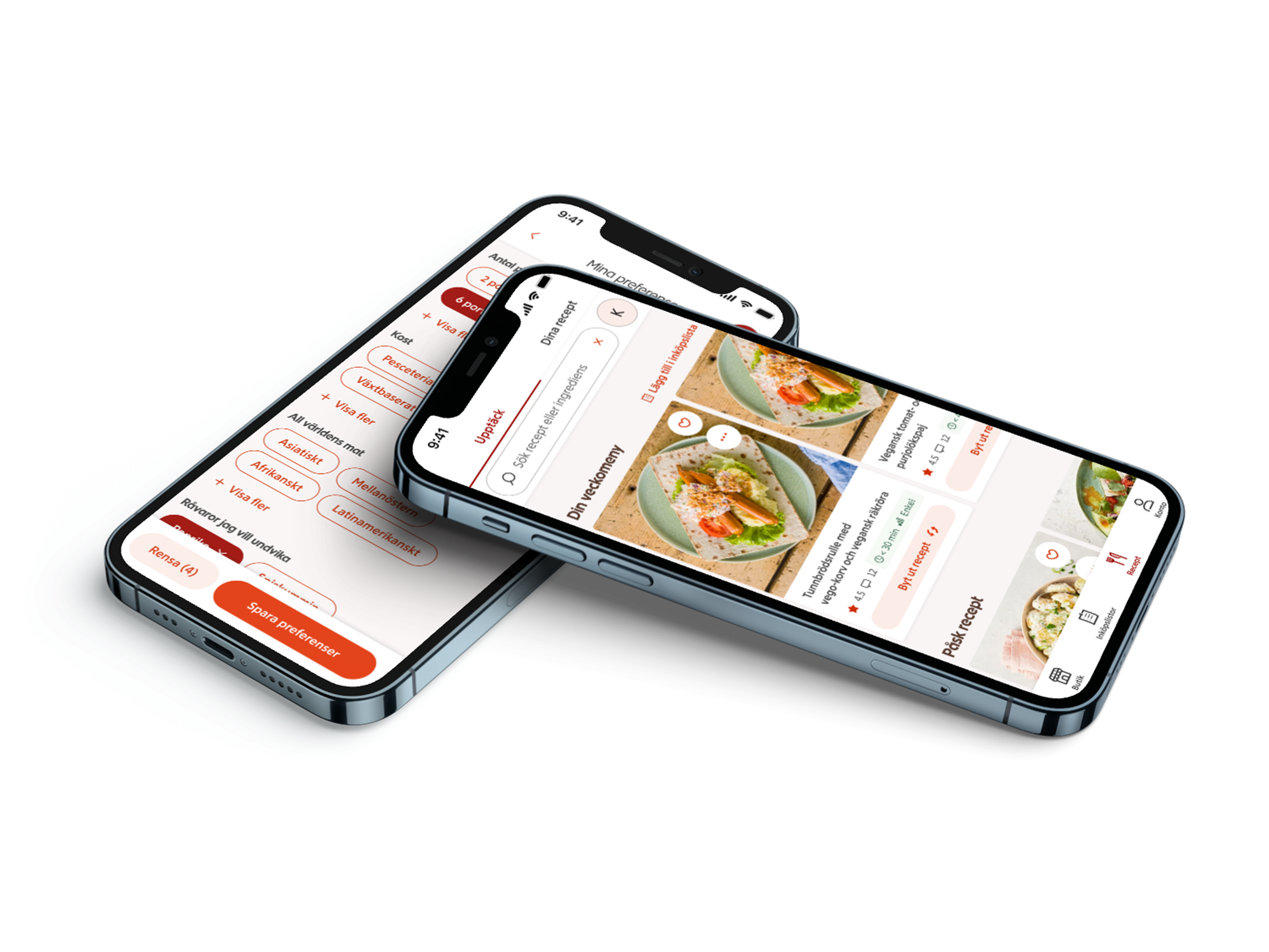
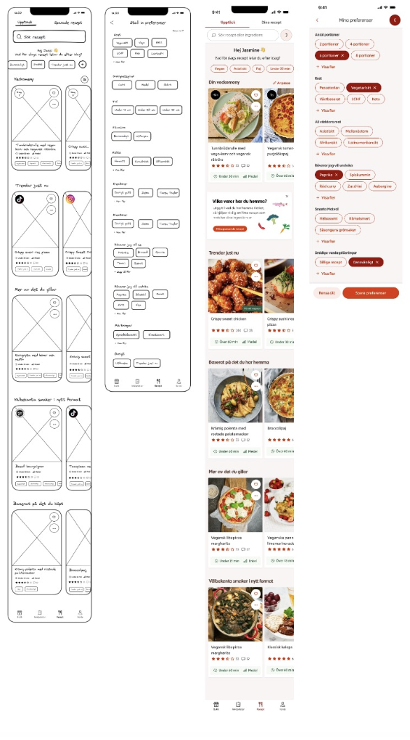
Final Design
*
Final Design *
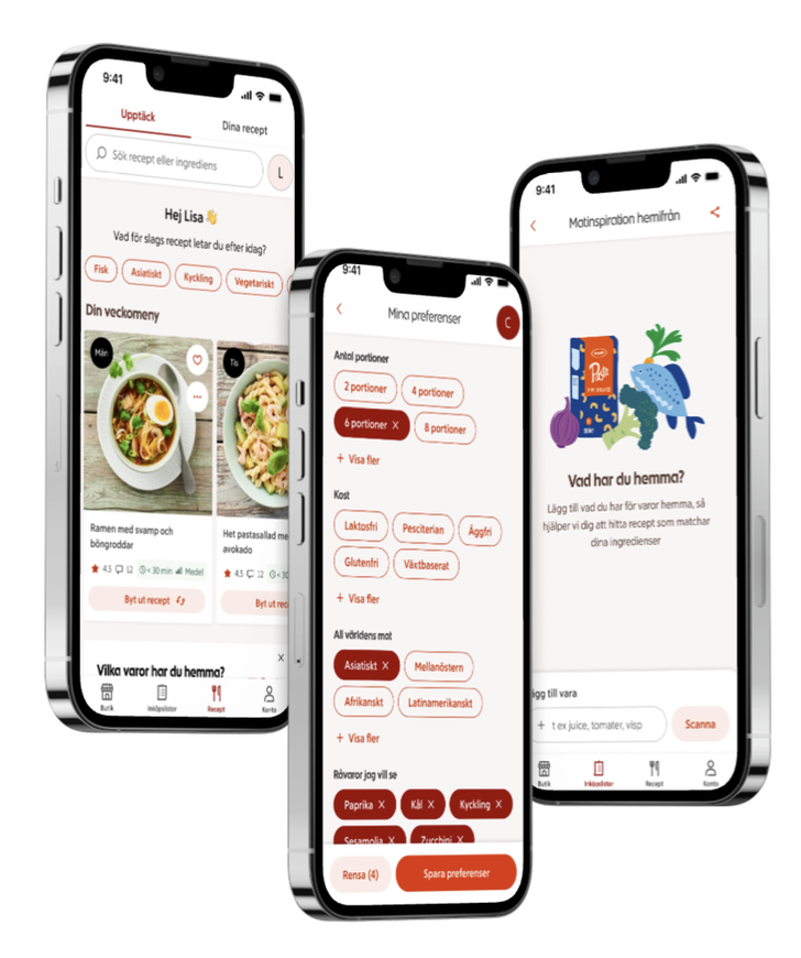
Based on the feedback, I iterated and improved the concept:
A more dynamic inspiration feed with the ability to swap out weekly recipes.
A settings page where users can adjust preferences anytime.
A new feature allowing users to input ingredients they already have and receive relevant recipe suggestions.
Lessons Learned and Next Steps
Throughout the project, I gained valuable insights—both from users and from the process itself. One of the most important lessons was the power of silence: giving users space to speak freely led to deeper, more honest feedback. I also learned the importance of focus—testing too many things at once can dilute results, so prioritizing features early on is key. When in doubt, I reminded myself to ask questions instead of making assumptions. And most importantly: to trust myself.
Looking ahead, the next natural step would have been to A/B test the concept to validate it on a larger scale. While I was only able to run user testing with five participants toward the end of the project, those sessions provided rich qualitative insights. However, A/B testing would enable quantitative validation—measuring engagement, behavior, and conversion across different design versions.
This would help answer key questions like:
Does personalization increase recipe engagement?
Do users complete their weekly planning faster?
Which features drive the most interaction?

✨ Thank you for scrolling ✨